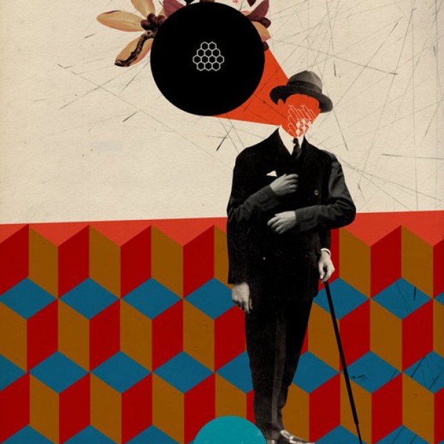
This guy, Emmanuel Polanco has a great eye for design. I stumbled upon this artist while looking up the rap music star school principal by the same name. Add the artist Emmanuel Polanco on Facebook and check out his website: http://www.inmelancholia.com/ Continue reading …
Multimedia
New York City in the 70s and 80s, It used to be Crazy!
Culture & Communication, Multimedia
New York City is still Crazy – and that’s why we love it! But back in the 70s and 80s things were out of control, Warriors style Continue reading …
Tell me to keep calm one more time and I will flip out
Culture & Communication, Multimedia
The original “Keep Calm and Carry On” poster (originally produced in 1939) is a powerful use of typography. It conveys confidence and is more “active” than regular old text on a page. Lately, we’ve seen a lot of funny takes on this poster – but now it’s old.
FROM WIKIPEDIA:
Keep Calm and Carry On was a poster produced by the Government of the United Kingdom in 1939 during the beginning of theSecond World War, intended to raise the morale of the British public in the event of invasion. It had only limited distribution, so was little known. The poster was rediscovered in 2000 and has been re-issued by a number of private companies, and used as the decorative theme for a range of products. There were only two known surviving examples of the poster outside government archives until a collection of 15 originals was brought in to the Antiques Roadshow in 2012 by the daughter of an ex-Royal Observer Corps member.
Lu Cong. An amazing artist
Culture & Communication, Multimedia
Lu Cong has quite the unique style. Emphasis on the eyes is clearly a major factor…something does make one feel that the subjects are doing more than being passive subjects. Perhaps it’s the simplicity of the characters, the type that typically don’t get the reward of being painted. Continue reading …
Life’s Realities – Satirical Illustrations by Pawel Kuczynski
Culture & Communication, Multimedia
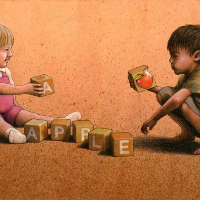
Pawel Kuczynski creates amazing illustrations that cleverly highlight life’s realities in a way that is quite unique. He brings out the good, the bad, and the ugly juxtaposing innocence with ignorance, irony with poverty, and hypocrisy with truth. Continue reading …
Help to Identify This Man! Tripped lady at bus station in Bogota, Colombia
Multimedia
Enraged that the lady came through the turnstile before him – the man in this video tripped the unsuspecting lady just right for a perfect face plant. It’s kinda funny…but still – pretty F’ed up – and so, the witch hunt is on…or as the video poster says in Spanish “Cruzada para encontrar a este bárbaro para denunciarlo y darle un escarmiento…” translation = “Crusade to find this barbarian to call him out publicly and teach him a lesson.“
The “Love Colombia” Facebook Page posted the video on FB, which received a slew of entertaining comments (so far 200+) — how interesting would it be if this guy was actually ID’d! He’d be so humiliated! Or he can turn it around and become an e-celebrity – like Antoine Dobson!
10/12: By the way…coincidentally I just read this on Colombia Reports:
Half of Colombian men admit to abusing their female partners, while 26% say they have tried to intimidate them in the past, according to a recent U.N. study.
What!!!
Yarbleck | Prep School Monster and Slick Duck by Somefield!
Culture & Communication, Multimedia
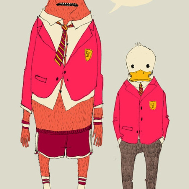
From the creative desk of Somefield – this image just stood out to me…it means so much – you got a duck with slick euro shoes and skinny euro slacks – he’s just chillin’ – saying “Hey, Here I am, Mallard Q. Duck, I’m here, staring right back at ya’ – of course I look nice – this was effortless…I’m a natural” — Continue reading …


